United States Post Office
AGENCY: FCB CHICAGO
ROLE: SR. ART DIRECTOR/DESIGNER
CD: TEDDY BROWN
DESIGN DIRECTION: GRAND ARMY NYC
As seen in Print Magazine and Deezen
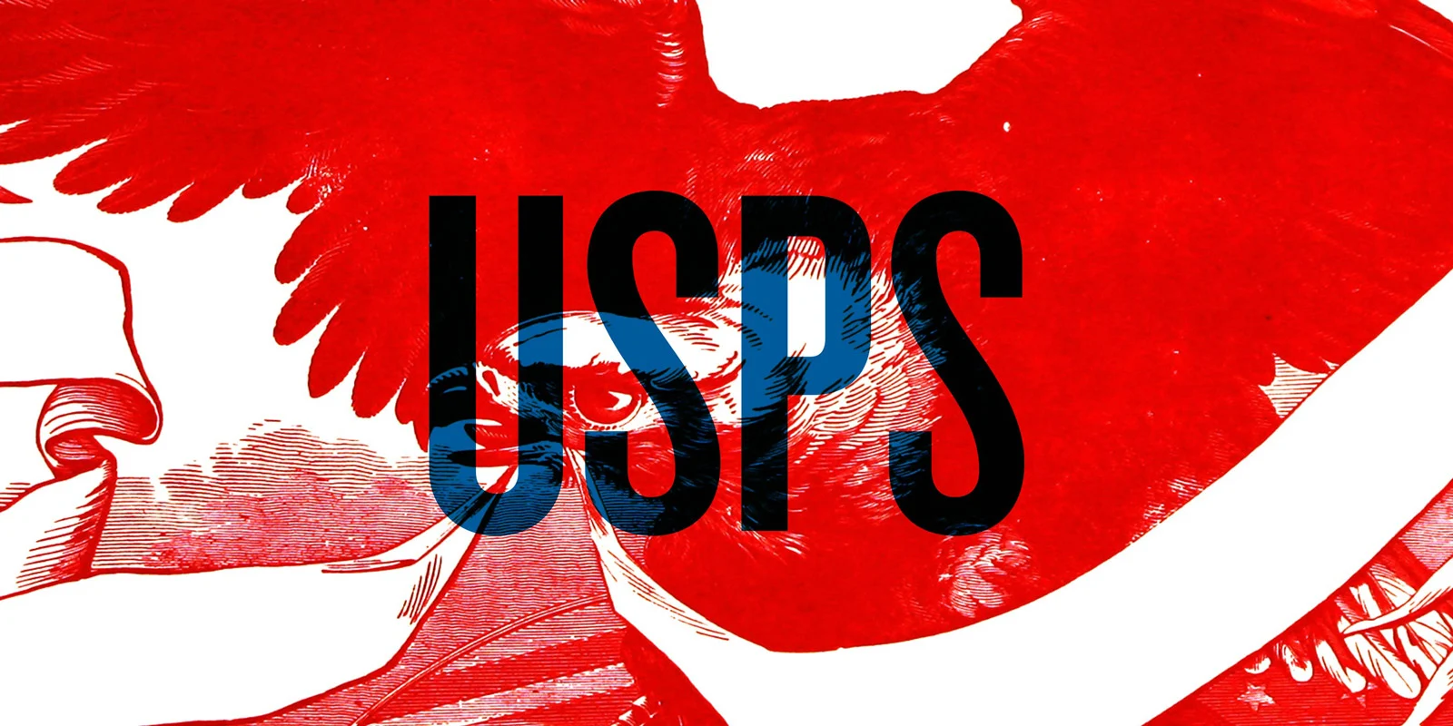
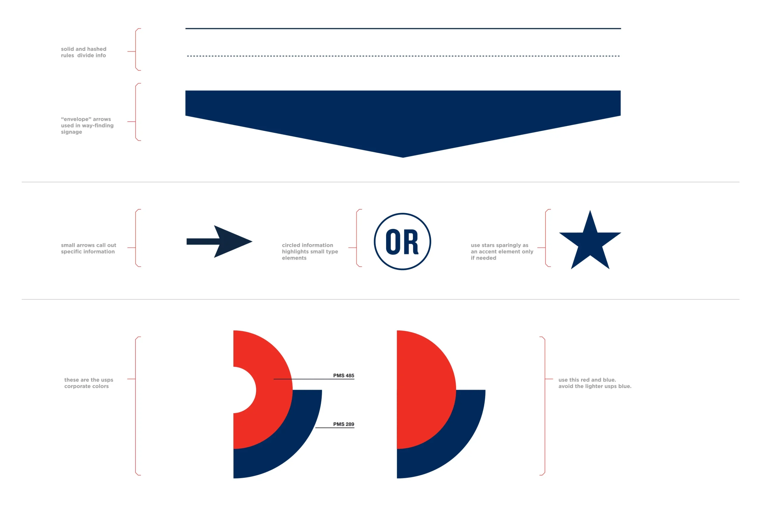
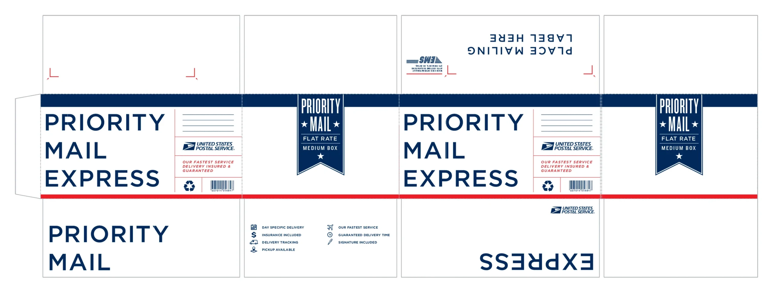
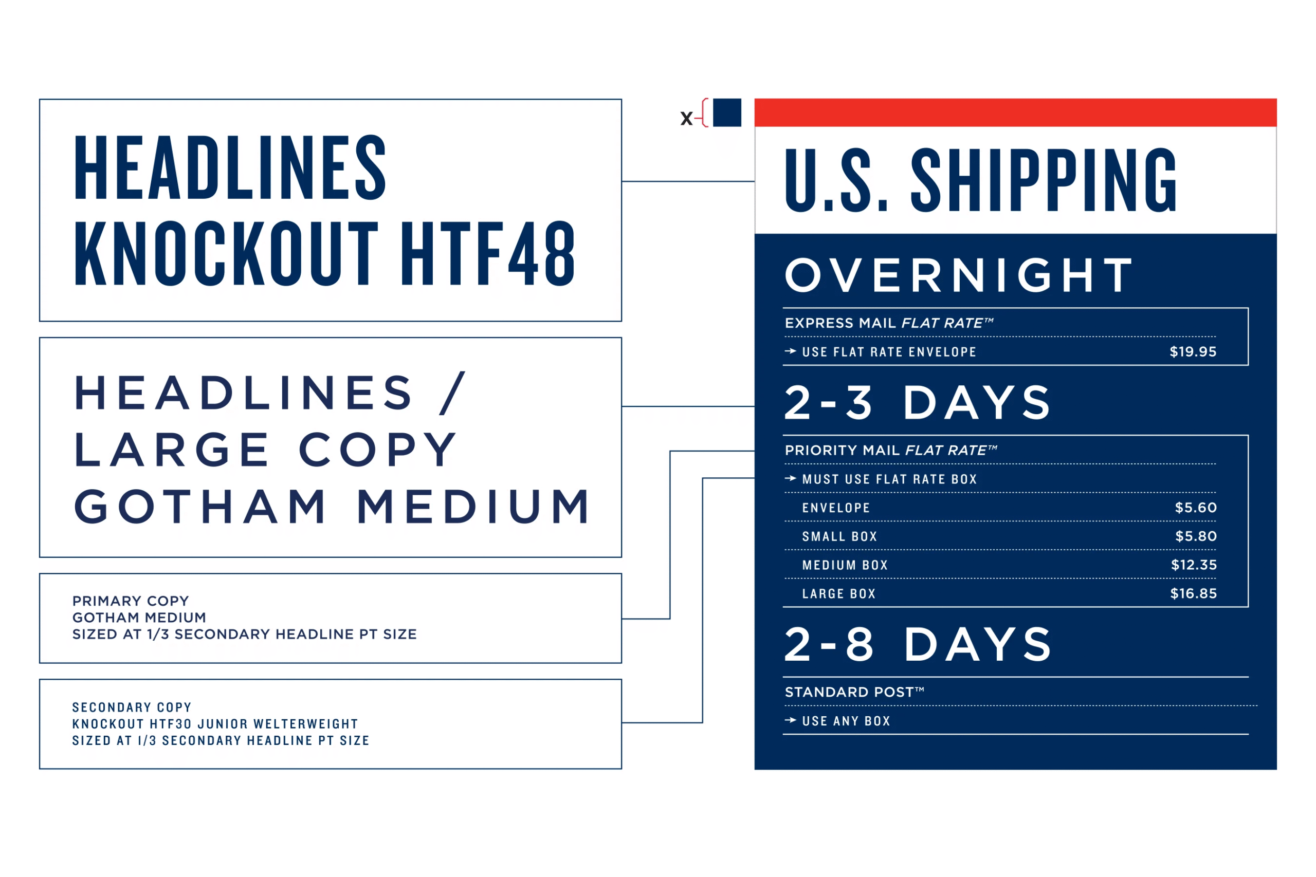
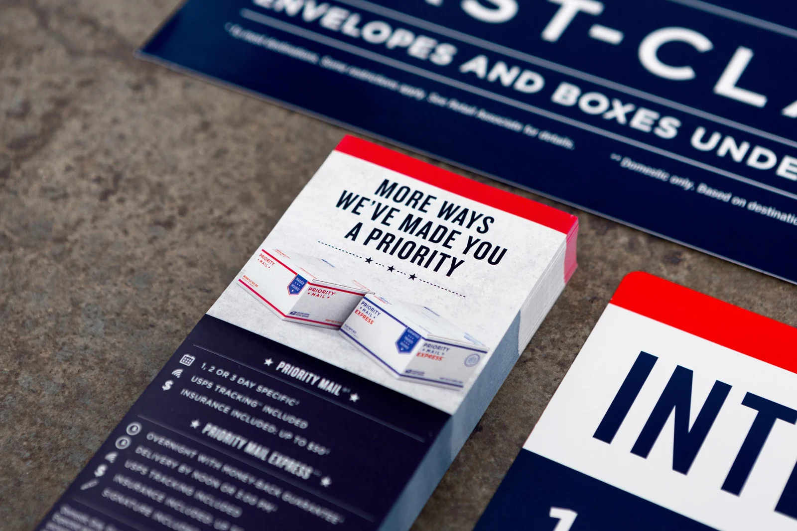
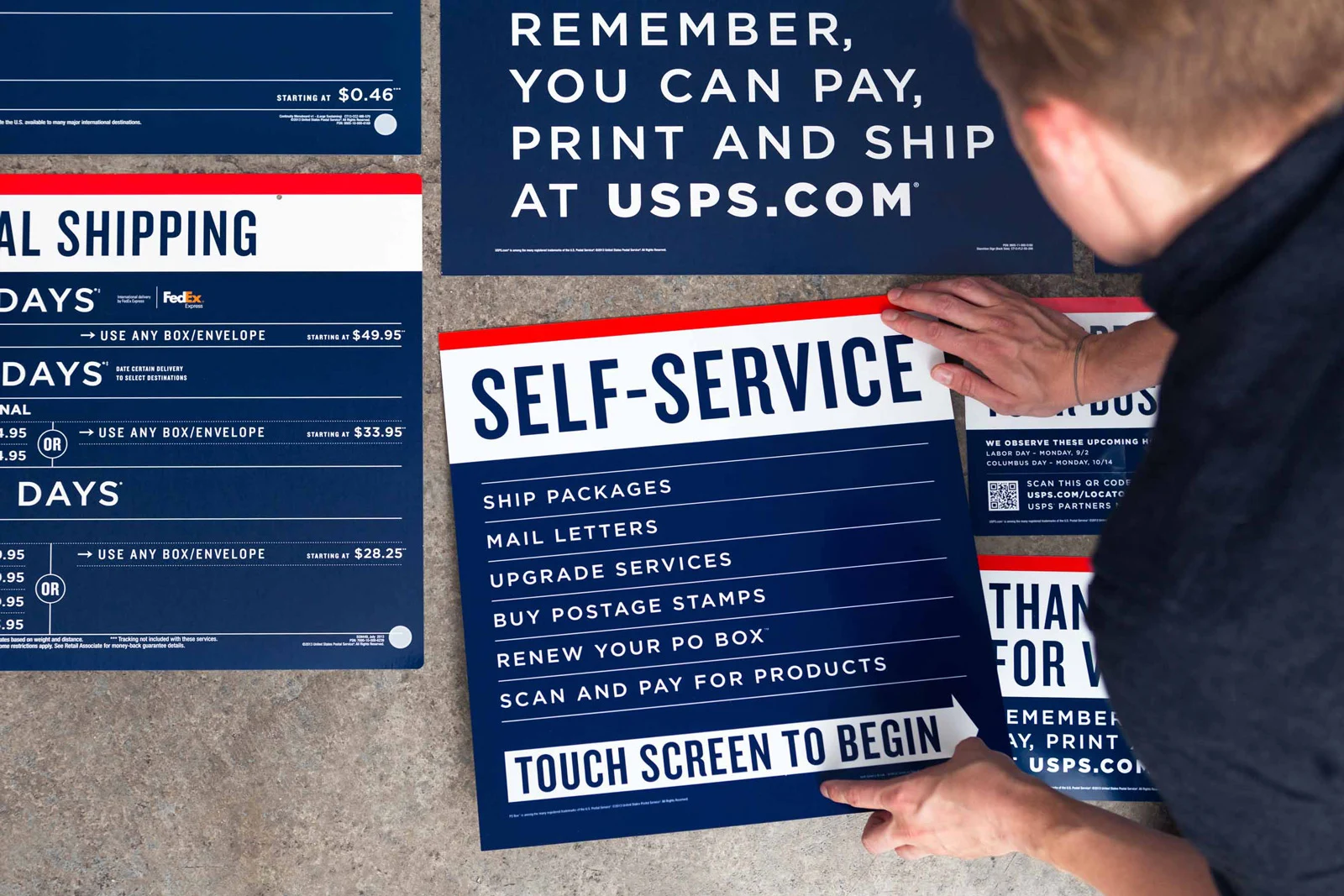
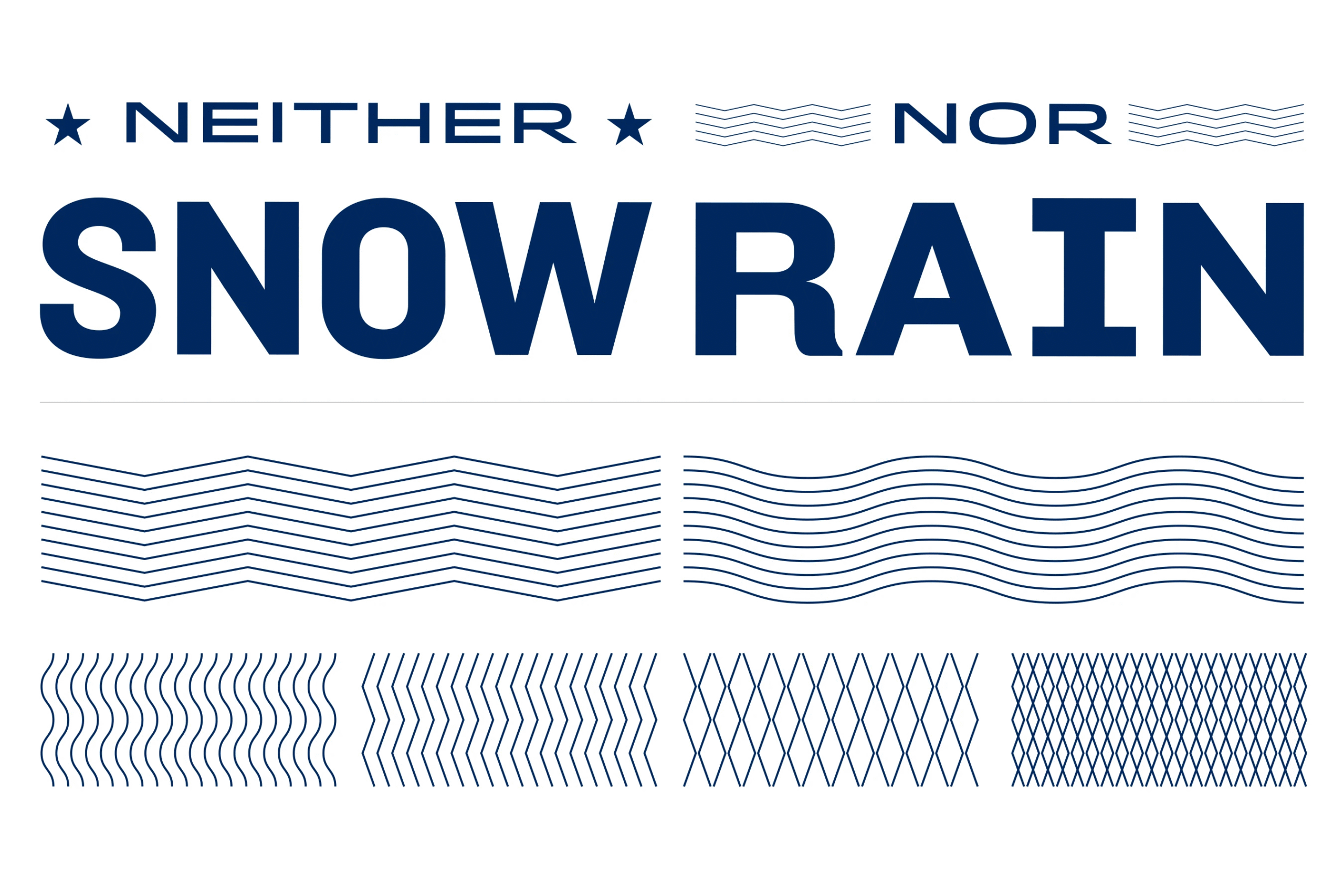
The United States Postal Service — one of America’s oldest civic institutions — sought to modernize its image and streamline its fragmented retail experience. FCB partnered with NYC-based design agency GrandArmy to develop a comprehensive in-store rebrand, introducing a three-bar layout system that unified signage, wayfinding, packaging, and digital touchpoints across thousands of locations. Rooted in USPS’s red, white, and blue heritage, the system employed a disciplined typographic and grid structure to improve clarity and consistency without structural renovation. The result is a modern, functional, and distinctly American identity that honors the USPS’s legacy while reasserting its role as a vital public service.
One of the biggest honors of my career is seeing the USPS priority packaging design that I spearheaded in the hands of everyday Americans across the nation.
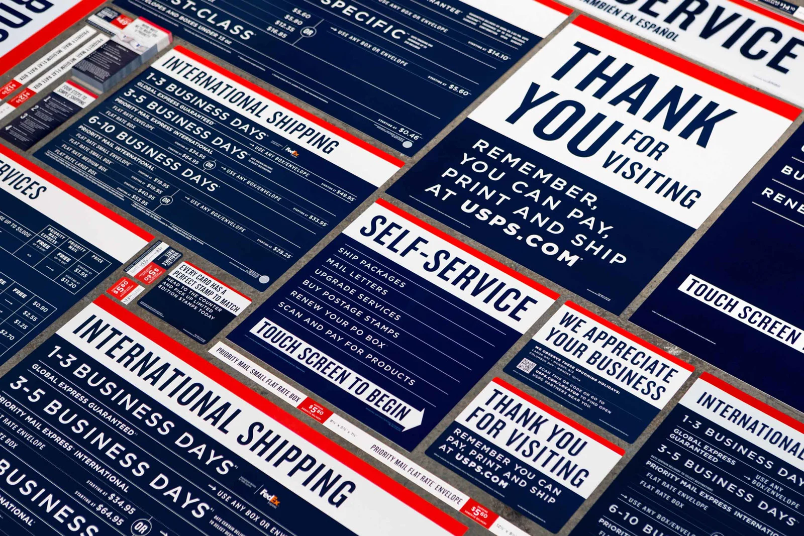
Design System
Branding Elements